N’005 — Subscription & Pricing UX.
Subscription & Pricing UX
End-to-end subscription experience across three pricing tiers — designed to make a complex metered product feel scannable, fair, and worth upgrading.
Client
Project Type
Timeline
Role
Live
Overview
Delivered a unified pricing architecture that scales across four product lines without requiring separate pricing pages or conflicting messaging. Upgrade flows tied to usage moments created natural conversion pressure at precisely the right time — when users already had skin in the game.
The Brief
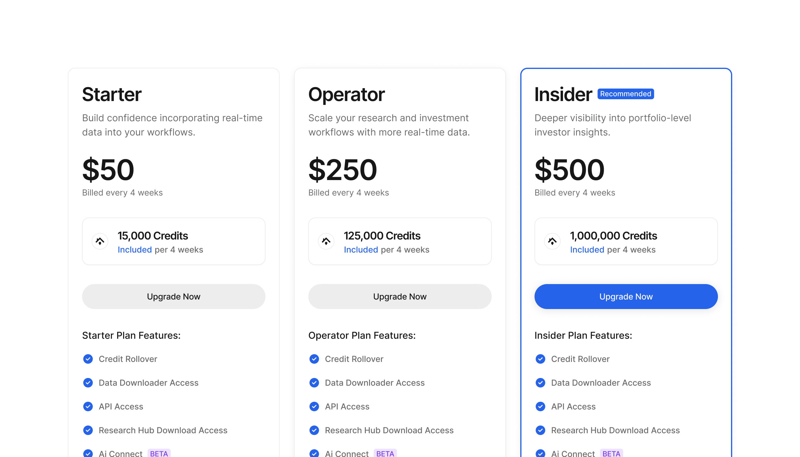
Pricing pages are where products either earn trust or lose it. The challenge was designing a subscription experience across three tiers — Starter, Operator, and Insider — that made complex metered billing legible to a non-technical audience of analysts, brokers, and fund managers. Every tier had different credit allocations, billing cycles, and overage rules across four distinct product lines. Presenting that clearly without burying the decision in fine print was the core design problem.
Four product lines had to be unified under one pricing architecture without fragmenting the experience or creating confusion about what each tier unlocked. Upgrade prompts needed to surface at the right moment — credit-exhaustion — rather than feel like interruptions. The visual hierarchy had to do real behavioral work: anchoring, decoy positioning, and tier comparison without resorting to dark patterns.
Applied behavioral design principles — anchoring, decoy positioning, and progressive disclosure — to make a complex metered billing system feel scannable and fair at first glance.
Decisions
Next Project
Unified Credit System UX